
What Makes Icons8 Distinct in a Crowded Field
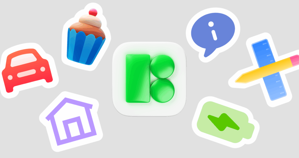
Icons8 is not just a vault of SVGs. It behaves like a coherent icon system with multiple styles, production‑grade consistency, and tooling that plugs into real workflows. You get families that echo iOS, Material, and Fluent, plus Color, Doodle, 3D, Glyph, DuoTone, Pastel, and Cute Outline. Each set is redrawn on a strict grid with harmonized proportions and stroke weights, so mixing styles does not create visual whiplash.
Depth matters too. Many ideas ship in outline, filled, and duotone. Some add rounded and sharp cuts, mirrors for directions, and micro versions tuned for tiny UI. That range lets hover, active, and disabled states read as states, not just as a color swap.
Workflow is the third leg. The web app handles recolor and stroke edits, the plugins cover Figma, Sketch, Illustrator, and Lunacy, and the desktop catalog Pichon works offline. You can build project kits, pin exact versions, and batch‑export the formats and sizes your pipeline needs. Designers get a consistent look, developers get stable SVG structure, marketers get crisp PNGs, teachers get clear metaphors without fuss.
Style Systems, Grids, and Real Consistency
Icons8 uses standard icon grids, commonly 16, 20, 24, and 32 pixel bases per style, then pixel‑fits strokes to land on whole pixels at common export sizes. A 16 pixel bell looks sharp because its paths sit on integer coordinates and are adjusted for small UI.
Proportions stay tight across styles. Cap heights, corner radii, negative space in counters, and stroke widths scale predictably. Swap outline for filled and the silhouette still feels identical. Cognitive load drops in dense toolbars, navs, and data tables.
Platform alignment holds. Fluent follows Windows idioms, iOS maps to Apple’s HIG strokes and corners, and Material tracks Google’s optical grid. Ship native clients with platform‑true icons and shared metaphors, and support gets easier across OSes and locales.
Formats, Technical Quality, and Accessibility
SVG, PNG, and often PDF ship clean. SVG paths are merged, groups trimmed, and strokes used where editability helps. You can inline SVG and theme fills or strokes with CSS variables, run SVGO without visual regressions, and build sprite sheets or React and Vue components from a stable path structure. PNG exports land on pixels, so email and CMS work stays crisp at small sizes.
Accessibility starts with metaphors and continues with contrast. Outline and filled variants make it easy to meet WCAG by pairing filled shapes with sufficient color contrast or adding outlines for tiny sizes. Tagging is sensible, so alt text and code names do not devolve into vendor gibberish. Animated icons arrive as GIF and often as Lottie JSON, which keeps motion lightweight and clean at any scale.
Search, Filters, and On-the-Spot Editing
Search understands verbs, nouns, and synonyms. Lock a style filter when you need iOS, Fluent, Material, or Color. If your class or brand prefers a playful voice, Doodle and Cute Outline show up in the same query without extra hunting.
Inline editing saves context switches. Recolor fills and strokes, nudge stroke thickness for outline sets, toggle backgrounds, and map multi‑color palettes to a small brand palette. Collections live in your account. Build a kit per product area, export a versioned ZIP, or sync to Figma. On desktop, Pichon enables drag and drop into mockups, IDEs, or slides, handy on locked‑down networks.
Licensing You Can Explain to Legal
Free usage usually needs a link attribution. Paid plans remove attribution and cover commercial use. Team plans give shared access so design and engineering pull from the same kits. Embedding in apps, sites, print, and marketing is allowed, while reselling as a stock library is not. Classrooms can use free with attribution or choose a team plan to simplify courseware. Always confirm the current terms on the Icons8 site and note them in your design system docs.
Developers: Shipping Icons Without Surprises
Engineering benefits from determinism. SVGs are uniform enough to auto‑convert into framework components that accept size and color props and tree‑shake cleanly. If you need legacy PNG sprites, batch exports produce consistent sizes and names that behave well with caching and CDNs. Consistent viewBox and baseline alignment make vertical centering reliable across buttons, links, and inputs, so you do not fight one‑off CSS nudges. Theming is straightforward with inline SVG and CSS variables, and outline sets tolerate small stroke width tweaks for tiny sizes. Wrap icons behind design tokens and component APIs to lock the chosen family and stop drift.
Designers and Students: Platform-True and Brand-True
Platform mirroring solves the classic split. iOS apps can look iOS, Windows apps can look Fluent, web can lean Material, while metaphors stay consistent. Set a brand palette once and recolor exports per platform so the experience feels native and still on brand. For students, consistent strokes and proportions make wireframes readable and critiques concrete. Outline sets communicate affordance early, then filled or color sets add emphasis at hi‑fi.

Marketing, Content, and Editorial Clarity
Color, Pastel, and 3D sets stand out on slides, social cards, and infographics, where thin outlines get lost. The 3D family gives depth for promos without a custom render pipeline. For multilingual work, pick culturally neutral shapes. Icons8’s tagging exposes alternate metaphors so download can be an arrow or an inbox, and calendar can be date. It is also why a search can land you on brand‑adjacent pages, like when looking for the windows 11 logo. The index cross‑links brand and platform styles to widen coverage.
Startups and Small Teams: One Library, Many Surfaces
Pick one outline family for product UI and a color family for marketing, then expand as you grow. Add filled variants for active states, animated icons for onboarding, and micro icons for dense data tables. One account, one license, fewer surprises. No patchwork of sources or legal footnotes.
Teachers and Educational Projects: Clear Metaphors, Fast Prep
Baseline‑aligned icons stay legible on cheap printers and washed‑out projectors. Pichon works offline on school networks. Set a small brand palette, export whole sets in one go, and drop animated icons into LMS modules for motion without After Effects.
Limitations and Practical Workarounds
Search can feel loose across styles or brands. Lock a style filter and curate a kit per project to avoid repeat hunting. A few legacy icons carry pre‑modern stroke logic or odd micro‑pixel fits at niche sizes. Re‑download the refreshed version since classics get updated. Multicolor recolor is strongest on limited palettes. Icons with gradients or highlights may need a vector editor to map brand colors precisely, so export SVG and adjust stops in Figma or Illustrator. Free tier attribution can slow legal reviews for commercial releases. A paid plan removes it and makes procurement clean.
Where Icons8 Shines Compared to Alternatives
Font Awesome is web first and style limited, so it is fast but narrow. Material Icons are perfect inside Google’s ecosystem and can feel off elsewhere. Noun Project is vast yet uneven because it aggregates many authors, so coherence takes curation time. Streamline is beautifully crafted with broad UI coverage and is a strong paid choice if you live in outline heavy interfaces. Icons8 wins when you need breadth, platform fidelity, and workflow tooling in a single place. Matching iOS, Fluent, and Material metaphors, batch recolor, and export without glue scripts is the differentiator.
Quality Checks Before You Commit an Icon to Production
- Preview at 16, 20, 24, and 32 pixels to catch blur, thin strokes, or cramped counters.
- Test light and dark by flipping foreground and background, then check contrast and silhouette.
- Swap outline and filled to confirm selected and active states read instantly.
- Drop the icon into a real component and verify baseline alignment with text.
Real-World Integration Scenarios
A SaaS dashboard design system uses Fluent outline icons for navigation, paired filled variants for active states, and a micro subset for 14 to 16 pixel tables. The Figma library links directly to Icons8. The codebase converts SVGs to React components with SVGR and colors via CSS variables tied to theme tokens. Dark mode ships by updating tokens, not assets.
A content marketing pipeline maintains a Color set kit for social and a Pastel kit for blog headers. PNGs export at 2x and 3x for Retina. A tiny CSV maps topics to icon names so writers request assets by ID. When brand colors shift, recolor the kit in the web editor, batch‑export, and replace files in the CMS with identical names to avoid broken links.
Bottom Line for Busy Teams
Icons8 treats icons like a system, not a stash. Platform‑true styles, consistent geometry, reliable SVGs, recolor on demand, and batch export cover design, code, and content without side quests. The tradeoffs are small and manageable with filters, curated kits, and a clear license choice. If you ship across web, iOS, Windows, and marketing channels, the combination of consistency, coverage, and tooling makes Icons8 an easy default. If you only need one outline set for one surface, a narrower library can work, but you will give up the cross‑platform fidelity and unified workflow that save time later.